.svg)


In a complicated IT environment, performance degradation and failure are occurring due to a wide variety of causes. In order to analyze such performance degradation and failures, it is increasingly necessary to compare and analyze various indicators.
No matter how well-structured a dashboard is, it's hard to see all relevant metrics on one dashboard. Furthermore, when a failure situation occurs, more relevant indicators should be examined and compared. What should I do if I want to see many indicators at once? This is where Wattap's metrics chart comes in!
If Watap's dashboard can recognize problems that have occurred in real time and identify failure points, the metric chart is a great feature to use when you want to analyze trend data in a specific time period in more detail. In particular, the Watap metrics chart can be more helpful in analysis because it provides all indicators that can be viewed by selecting a specific time period and a specific monitoring target.
The downside of traditional metric charts is that they are a bit complicated. However, the metric chart function has been reorganized to make it easier and more convenient to analyze various situations. Let's take a look at what's getting better from now on. 😊
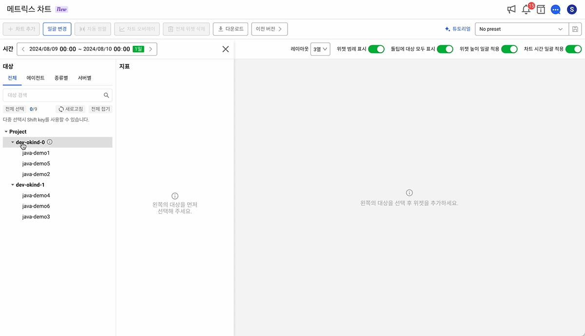
1. Select time, target, and metrics all at once!
When viewing metric data collected from a monitoring target on a chart, the time, target, and indicator must be specified. Previously, when selecting these three, the route was complicated, and it was inconvenient to check how the settings were made.
On the screen that has been reorganized this time Show all the options you need in one panelThus, you can add a chart while checking it at a glance. Also, once all required charts have been added, the Add Chart panel can now be completely closed. A larger areaCheck out the chart easily and neatly at!
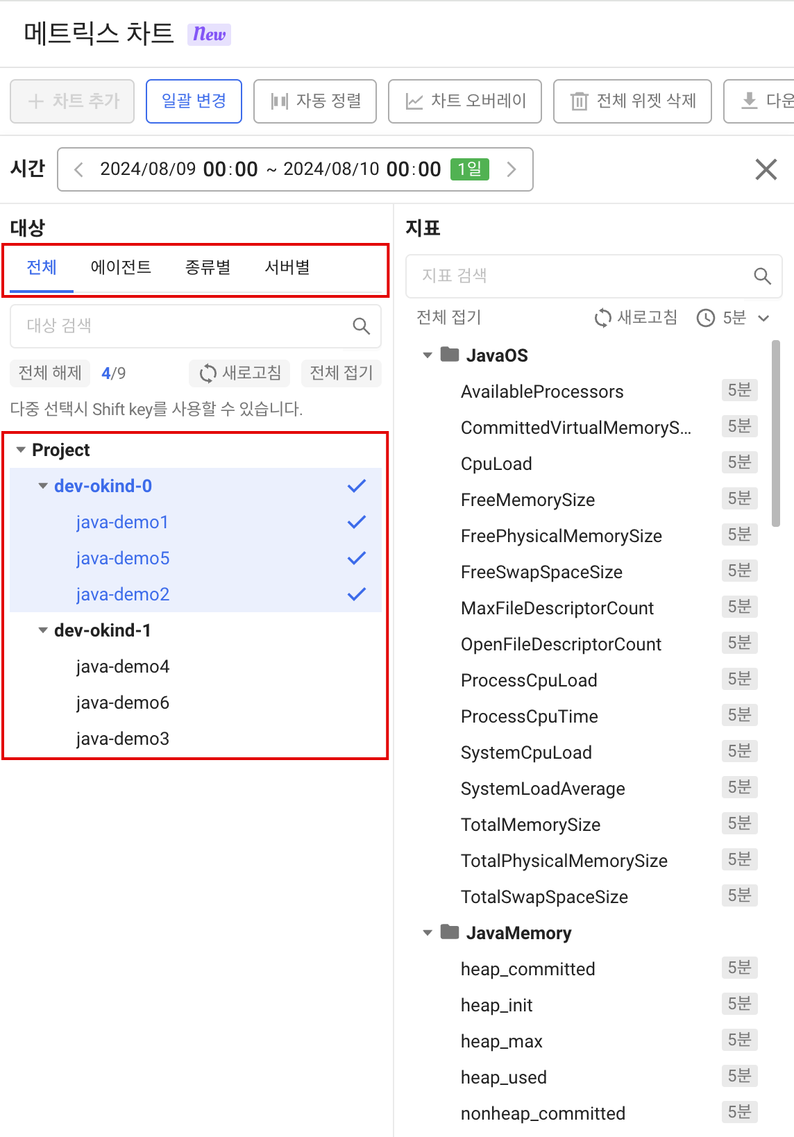
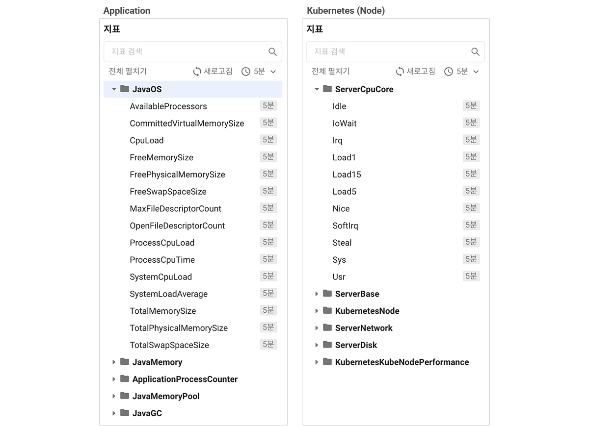
2. Target selection is an intuitive tree list view, and even a multiple selection function!
Conventional metric charts use the collapse method of selecting targets and then expanding and selecting each list. The collapse method was cumbersome because it required multiple clicks to find and identify targets.
Through this reorganization Change the structure to a tree listSo Project → Object Kind (Object Kind) → Object Name (Object Name) Intuitively check the hierarchyI can do it now! Also, to make it easy to select multiple monitoring targets Shift Key, a multiple selection function, has been addedIt's done. In the future, expand the list all at once to understand the structure and make choices!
* The category structure of the target list may vary according to the target characteristics of each product.
3. Collect only useful indicators for analysis at a glance!
The metrics collected by Watap are very diverse. However, some of the customers that come into contact with Watap now say that it is sometimes difficult to know which indicators to look at because they are given so many different indicators.
In order to solve such problems Organize a list of metrics by grouping commonly viewed metrics and indicators that are highly relevantI did it. Use it when you're not sure what to watch!
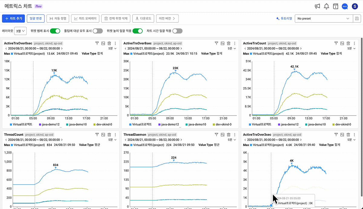
4. An easier way to change the chart layout!
Some people sometimes found it difficult because the metric chart layout requires meticulousness instead of being freely arranged. Now we've added a layout mode to make changes easier! If you select the number of widgets to be placed in one line, you can view them in a responsive manner grid mode, Can be freely arranged as before User-defined mode Choose from them and arrange the chart easily!
too [Apply widget height in batches] function, which can be useful when resizing multiple charts, and [Auto Align] function that organizes margins and alignment that occur when changing the position of a chartcan be used in all layout modes!
5. Added a convenient function to use 1000% of metric charts!
- Preset function
- If you want to create a pattern for repeated analysis or a dashboard for analysis [presets] Take advantage of the features! If you save the added widget as a preset, [Batch changes] Since the function can be analyzed while changing the time zone and target, it is possible to identify frequently occurring issues, report regularly, etc. Handle repetitive tasks a little easier and simplerYou can do it.
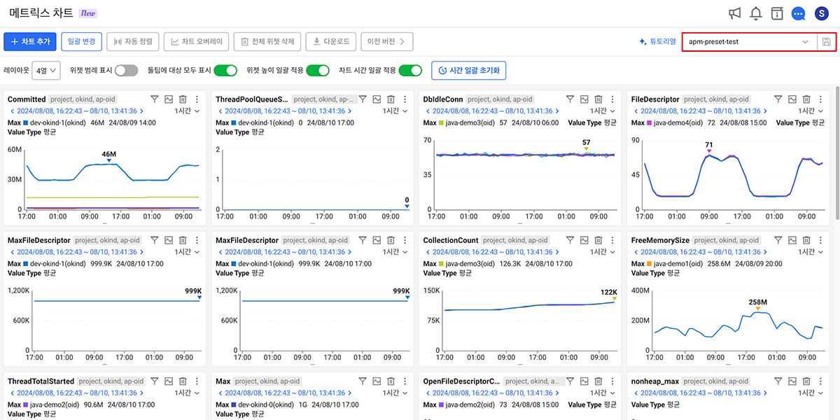
- Batch application function
- Modify the time, target, and interval of an added chart at onceIf you want to [Batch changes] Try the feature! You can more easily compare trends over a specific time period and by target.
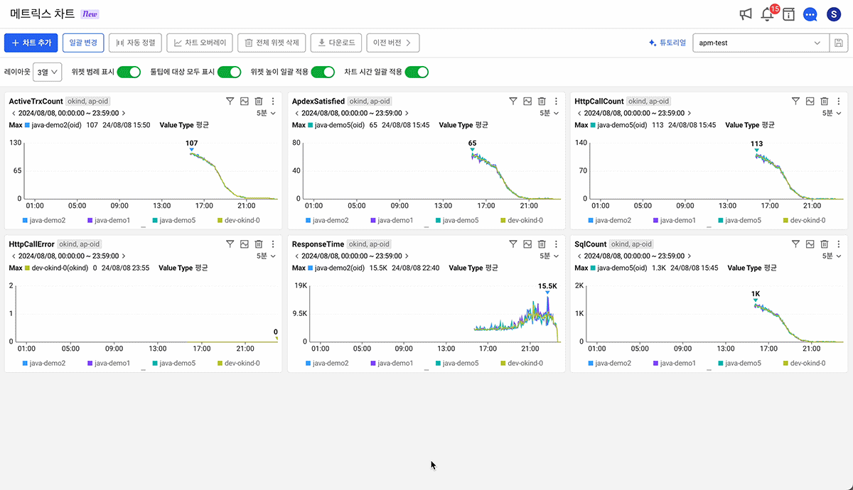
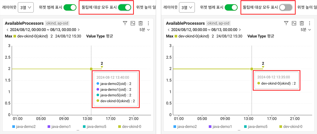
- Widget legend display function and tooltip target display function
- Previously, there was no support for displaying legends when viewing data trends for multiple targets. Through this reorganization [Show widget legends] A feature has been added! too Show all targets in chart tooltipsYou can now choose whether to do it. Use the option toggle button at the top to easily change settings.
- Ability to apply specific chart times in batches
- If you see something you want to look at in more detail while looking at chart trends, if you want to see all the indicators added to that segment together [Apply chart time in batches] Turn on the options and try dragging the chart! The one I added All charts are zoomed in to the dragged time rangeIt will be. If you want to return to the range you initially viewed after checking [Time batch resetYou can go back by clicking the] button.

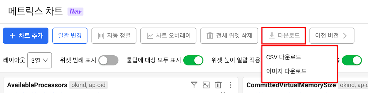
- Advanced download features
- Previously, when I wanted to download chart data, I was only able to do it in individual chart widget units. Now Download full chart dataYou can do it! Easily download and use data when sharing metric chart data with nearby colleagues, creating reports, and secondary data analysis.
What is Watap's new metrics chart menu Use after the regular distribution of the service on August 26If you can do it and would like to meet someone a little sooner preview.whatap.ioFrom today, August 22nd We can meet you!
If you have any good points, inconveniences, or suggestions while using the new metrics chart, chat within the service csm@whatap.io Please forward it to! WTAP will strive to provide better services using customer feedback as a driving force!
Thank you 😊