.svg)

Hello, this is WhaTap Labs!
A lot of changes are taking place in WhaTap in February. Today, I'd like to introduce the second change!
📍 How are heatmaps different from transaction maps?
A heatmap chart is a method of expressing the number of transactions that occurred over a specific period in density, and when the number of transactions is high, it is displayed in dark color, and when the number of transactions is low, it is displayed in a bright color. In the case of heat maps, transaction distribution information is managed by segment, so trends over a relatively long period of time can also be checked. However, since transactions are summed and displayed in 5-second increments, it is difficult to understand the distribution of individual transactions.
To analyze the distribution of long-term, high-volume transactions, we recommend using a heat map, and using a transaction map to check the detailed status of each short-term transaction, such as performance testing or failure conditions!
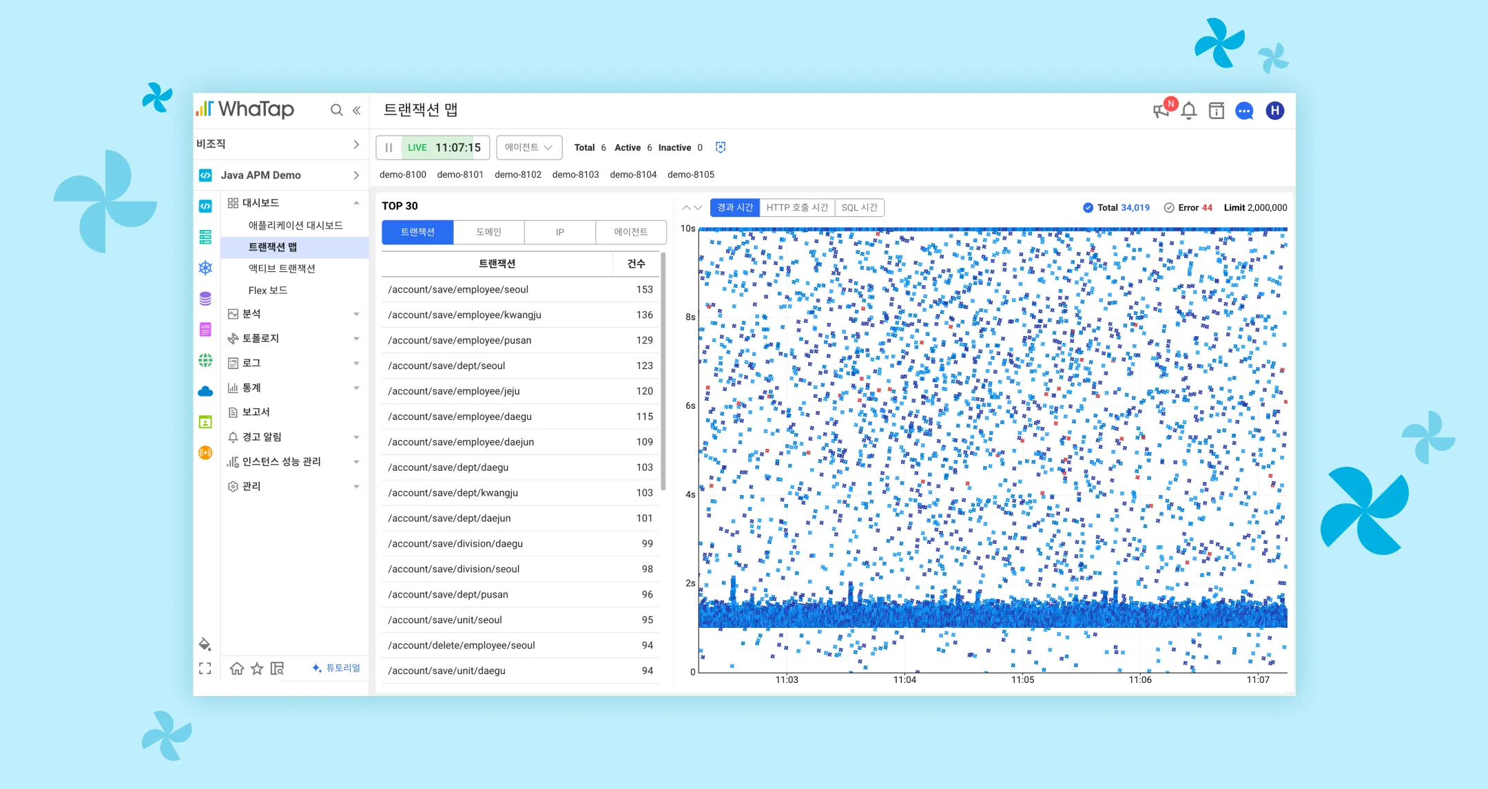
The transaction map has changed like this!
A slightly more detailed and convenient filter function

Before
- Previously, in order to use the filter function, it was cumbersome to click the button several times. Even if you wanted to sort the TOP 30 by category or change the Y axis of the chart, press each setting button and then select and set additional settings.
After
- The structure has been reorganized so that filters can be applied on one screen to minimize button clicks.
Filter No. 1 can be used to search past points in time. For example, transactions with a short execution time can be excluded from the chart using the elapsed time filter, or only selected transactions can be selected and viewed using the transaction filter. Filters 2 and 3 can be conveniently set by changing the tab method, and can be used in both real-time and historical point of view.
Slightly more, richer number of trace analyses
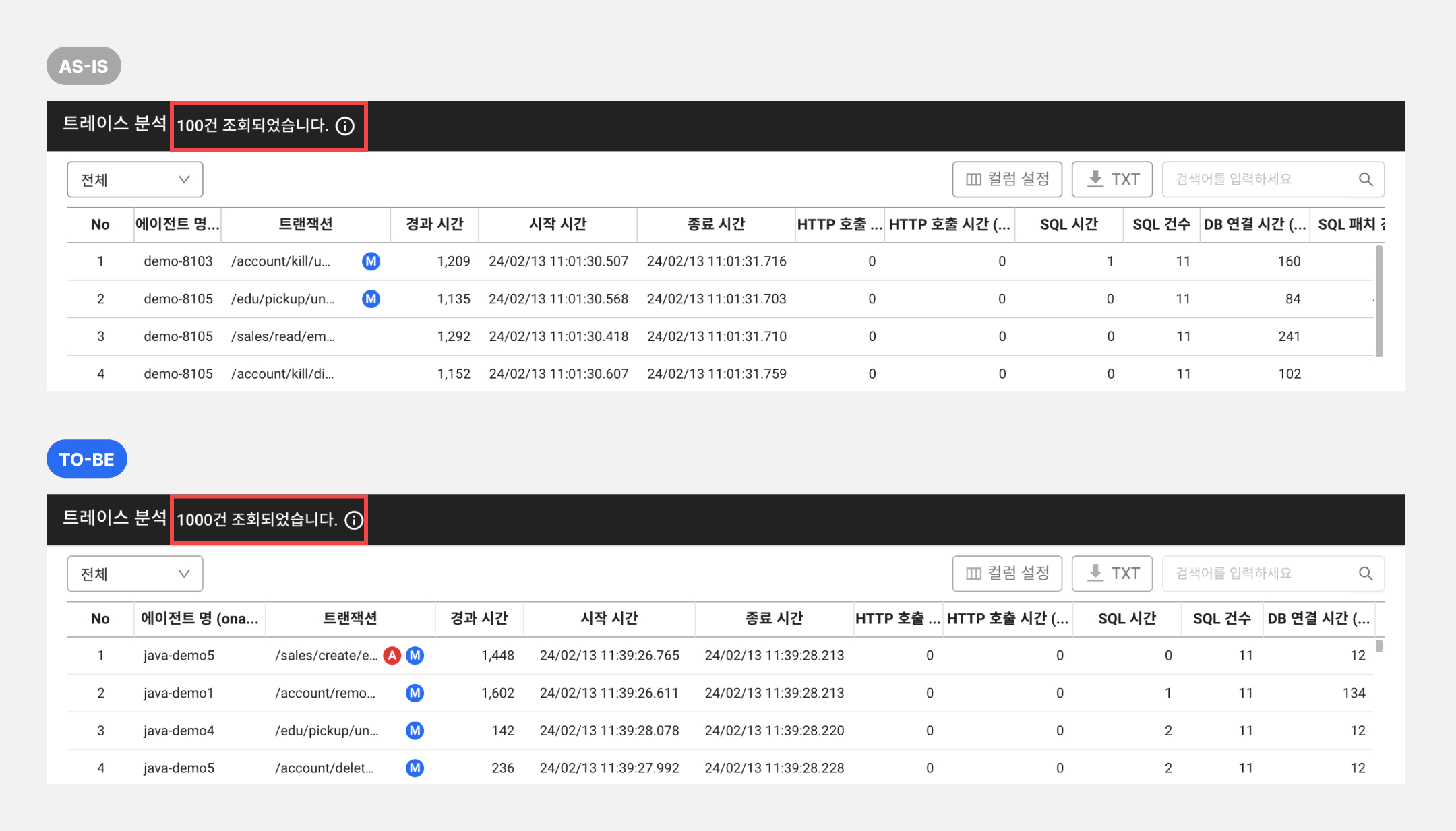
Before
- Previously, a maximum of 100 items were displayed.
After
- Up to 1000 items are displayed. When checking a constant pattern or distribution, you can analyze 10 times more traces than before.
Here are some secret tips to follow if you want to look like a Wattap expert 🐝
Hidden keyboard event!
- After selecting one filter value from the TOP 30 list, you can change the selected value using the up and down arrows.
- If you select a chart section in the transaction map, you can change the maximum value on the Y axis using the up and down arrows.
(*Click the mouse to select the first one.)
What if I want to select multiple TOP30 lists?
- Press the control button (*command button on Mac) and select the items you want! You can make multiple selections.
If you have any questions, please feel free to leave a chat inquiry or through our support channel and we will respond quickly. Also, feel free to share your feelings while using the new menu through our support channel. WTAP will provide a better service based on your valuable feedback!
Where can I check the new transaction map? Get started with Watap monitoring for 15 days for free