.svg)


Hello, this is WhaTap Labs!
After 5 years, the side menu of Watap Monitoring has been refurbished. The menu is a common part displayed on any screen, and it is a very important area that acts as a navigation area where you can quickly find the desired function. Therefore, changing the UI that customers are familiar with requires a lot of determination. Nevertheless, I made a firm decision to reorganize the side menu.
A new side menu after 5 years to improve user convenience! Let's take a look at why and what parts have changed from now on.
Side menu, why did it change?
Watap's service requires a step called 'Project Selection' before selecting a menu. The multi-tenant structure uses a single monitoring product for each business unit, but the independence of each team/task is guaranteed, and the central administrator can control it in an integrated manner.
Therefore, it is very important to make the process of creating, selecting, and managing projects more convenient so that customers can use the Watap service more effectively.
Over the past 5 years, many features and monitoring products have been added to Watap. When I displayed this in the menu, the UI itself became more congested, and I received feedback that “it is difficult to intuitively grasp the structure of the group/project.”
The existing menu is designed with a UI structure with a list of projects at the top and a menu corresponding to the project at the bottom to make selecting projects easier and faster. However, as the number of projects and menus increased, there were too many functions and information displayed in a narrow area, causing inconvenience in areas where the menu could not be viewed at a glance and had to be scrolled.
In order to resolve this inconvenience, a reorganization was carried out with a structure that reduces UI congestion and secures separate areas for project selection and menu.
Side menu, what changed?
A list of projects to unfold at once
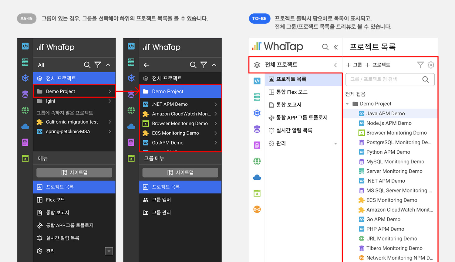
The list of existing projects was displayed directly at the top of the menu and could be selected. Being able to select a project and view the menu without going through the project list page was an advantage, but as the number of project lists increased, and groups and organizations were added or projects started to be grouped, the project list could not be viewed at a glance, making it difficult to intuitively understand hierarchical relationships.
The project list has been changed to a popover format where only the selected part can be viewed by expanding it. Since the menu can be displayed by expanding it, it is now easier to check and select the project list details. Also, groups and projects have been changed to a tree UI so that grouping relationships can be viewed more intuitively.
Expanded menu and project list area
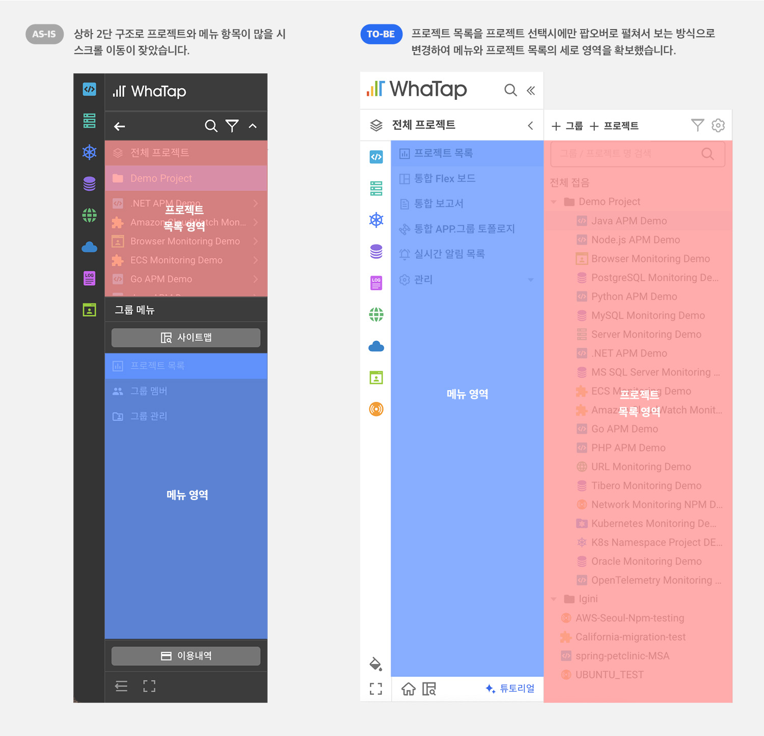
The menu was placed below the project list because the menu structure changes depending on the group/project selected. The menu grew and there wasn't enough vertical area to unfold, so I had to scroll frequently when checking the menu.
After the reorganization, the menu was expanded sideways to secure a vertical area. You can open up a menu of various functions more comfortably without having to scroll.
Added a menu mode that takes into account various layouts
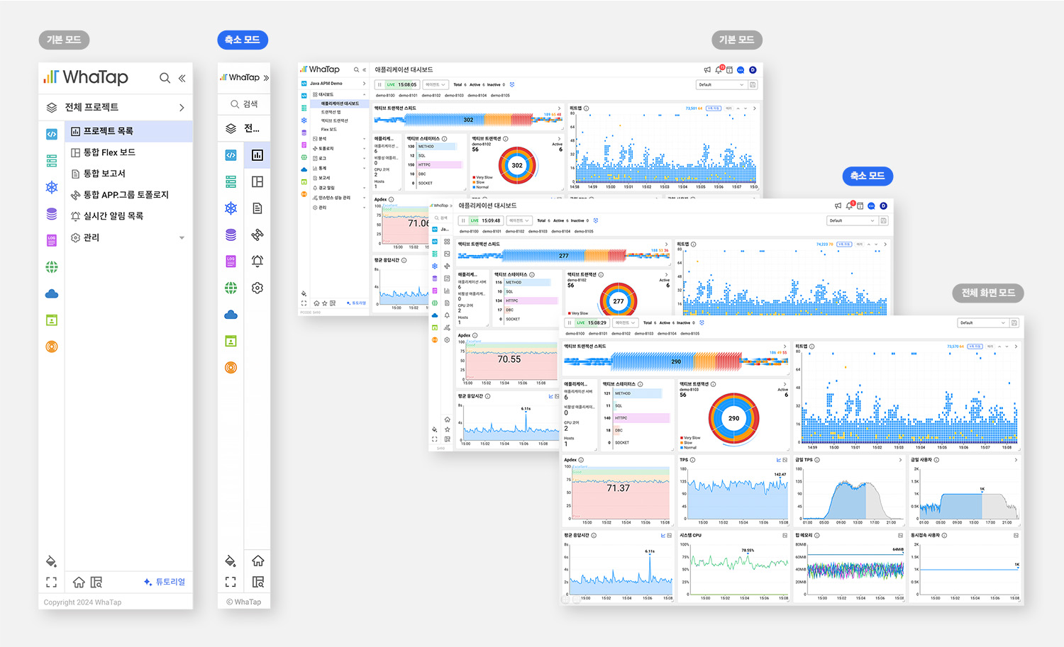
Previously, you only had the ability to fold and hide or expand the side menu. A menu collapse mode where only icons are displayed has been added to this. You can view a wider area of content while displaying the menu in a fixed manner. Click the full screen mode at the bottom to switch to a dashboard mode where the side menu and header area are hidden, similar to the previous side menu hiding function.
Project menu favorites feature added
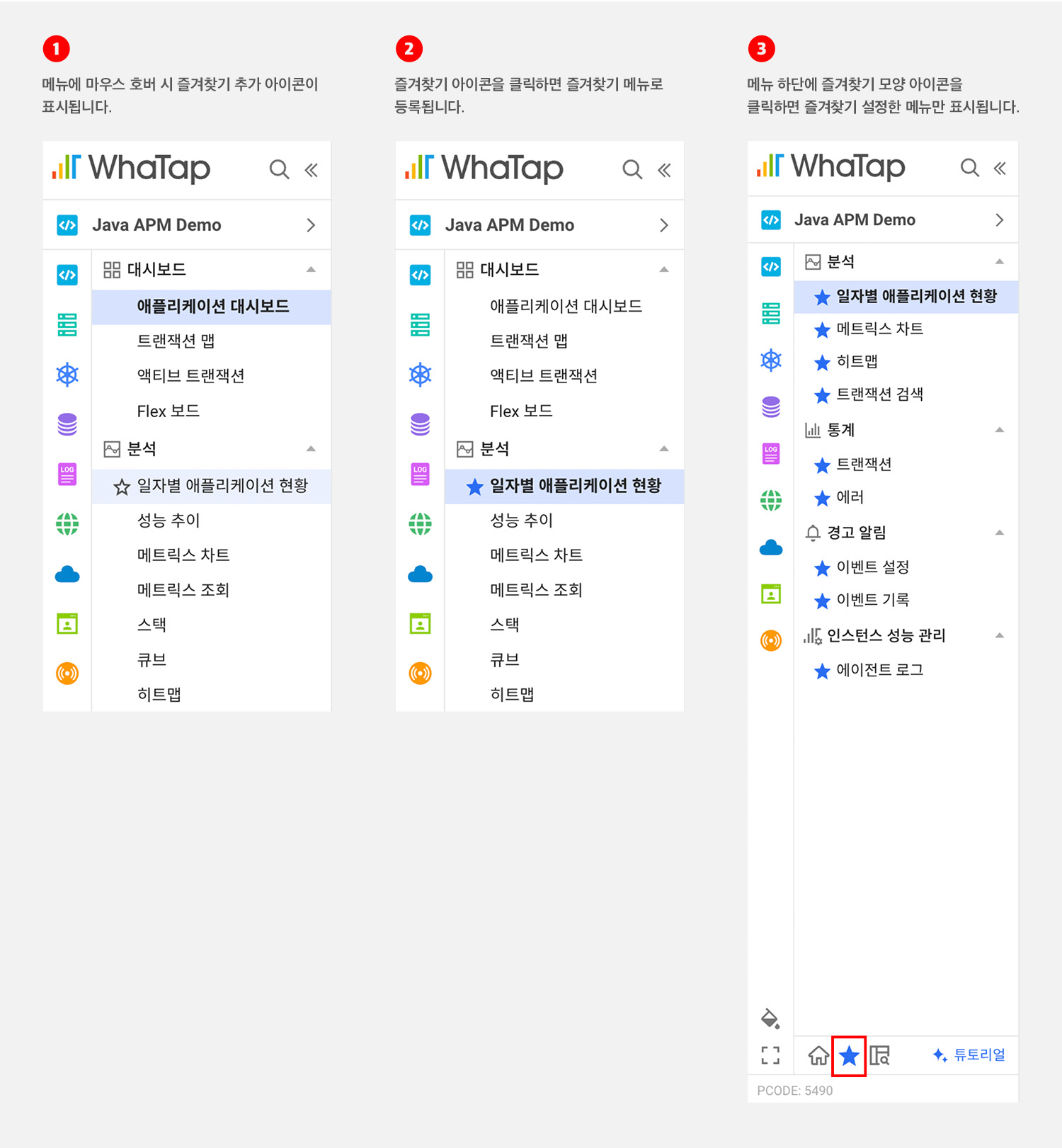
A bookmark function has been added for those who are disappointed that there is no function to view or edit only frequently used menus. If there are many project menus for each product, you can display mainly frequently used menus. You can simply register/unregister a favorite by clicking the star icon, and only the menu set as a favorite is displayed when you click the favorite icon at the bottom.
Rearrange icons and buttons to take into account the relevance and importance of features within the menu
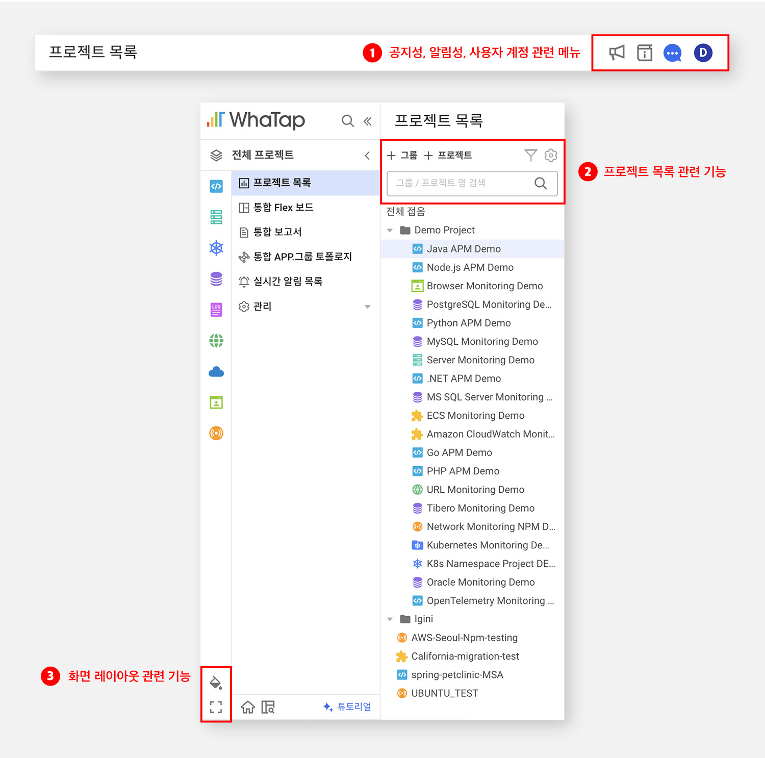
Related functions have been gathered in one area and the option buttons and icons have been rearranged to make them easier and more convenient to use.
- Menus related to notifications, notifications, and user accounts are placed in the header area.
- The project list area contains functions for adding, searching, and managing groups/projects.
- Options related to screen layout, such as themes, were placed in the side menu.
Support for theme features to improve UI consistency
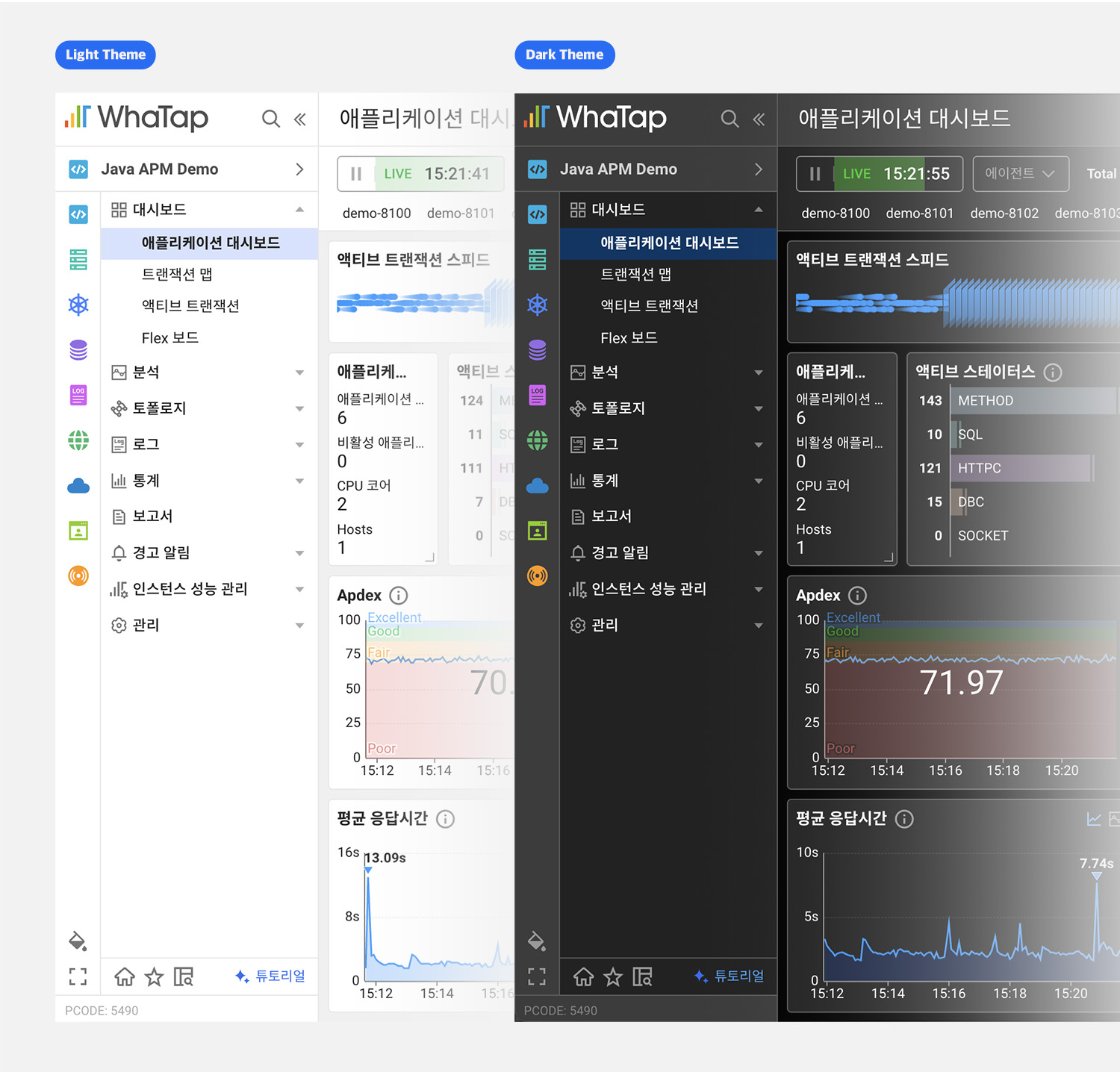
Previously, theme functionality was applied to only some pages. The theme functionality is now applied to all pages, including the side menu, rather than being divided by page. (*Some unsupported pages will be applied in the future.)
Side menu, when will it be applied?
What is the changed side menu After Wednesday, February 28, 2024It has been applied to the service and can be used since.
If you want to experience the changed side menu first, you can check it out in advance by clicking the Try the new side menu button below and logging in with your existing account. (* This preview.whatap.io site is a separate site that operates a beta service to be launched by WTAP, which is different from service.whatap.io.)
If you want to know how to use it in more detail, WhaTap's user guide (here)Please click!
If you have any questions, please feel free to leave a chat inquiry or through our support channel and we will respond quickly. Also, feel free to share any feedback or improvements you feel while using the new menu through our support channel. WTAP will provide a better service based on valuable feedback. 😊
Would you like to meet the new Watab? Get started with Watap monitoring for 15 days for free