.svg)
.svg)


WhaTap heatmaps for trace analysis have changed
Hello, this is WhaTap Labs.
We have been analyzing the usage patterns of our users and collecting valuable feedback from our clients for six months. As a result, we have improved the analysis flow and usability of the heatmap area, which is frequently utilized in our application monitoring service. We have improved the heatmap service of our flagship product, Application Monitoring.
We will introduce how we have changed the heatmap to make transaction analysis easier and more intuitive from a statistical perspective.
Adding, editing, and repositioning columns just got easier
With this upgrade, we are making it easier to edit, add, and reposition columns on the heatmap transaction page to better align with your priorities. You can now apply and group columns based on data importance and type to make it easier and more intuitive to see the information you want.
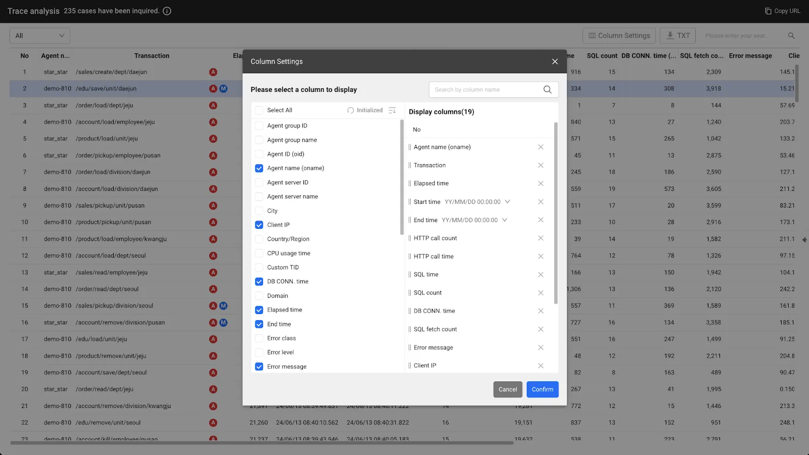
Columns can be added, edited, and repositioned with checkboxes
We have improved analysis flow and usability to monitor multiple transactions at once
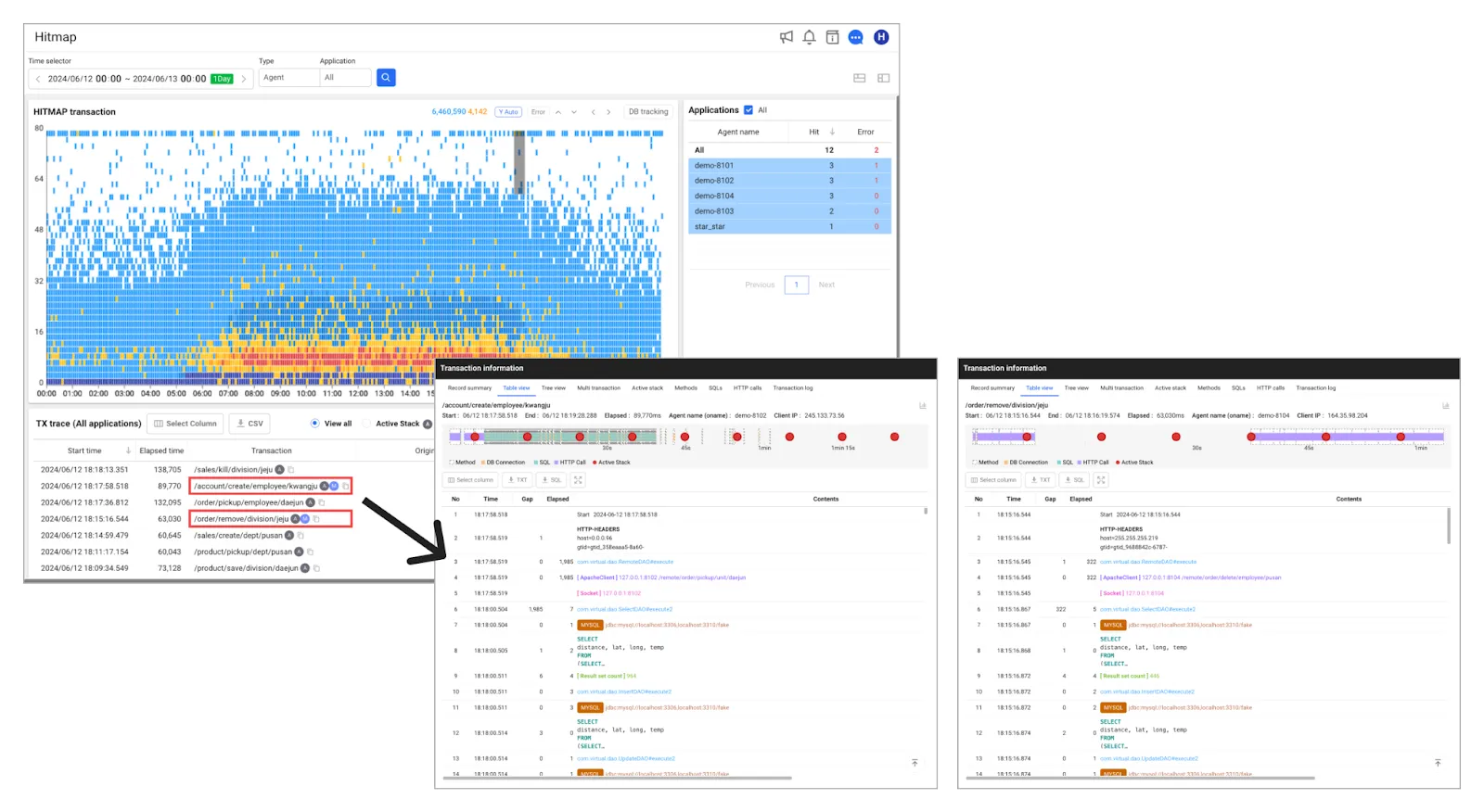
In the old heatmap chart, dragging a specific block range area would take you to the heatmap transaction page. From there, you would repeatedly drag the heatmap to view issues within the transaction, which required a complex path to get to the results for data analysis.
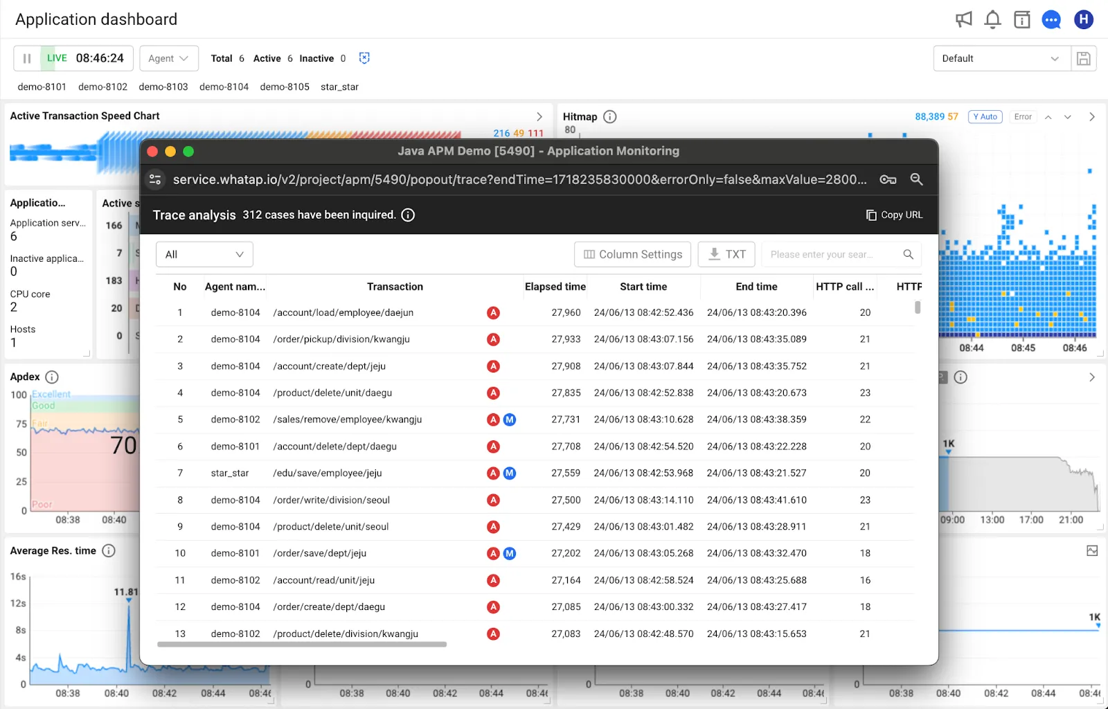
Path: [Application dashboard] → Drag from heatmap widget
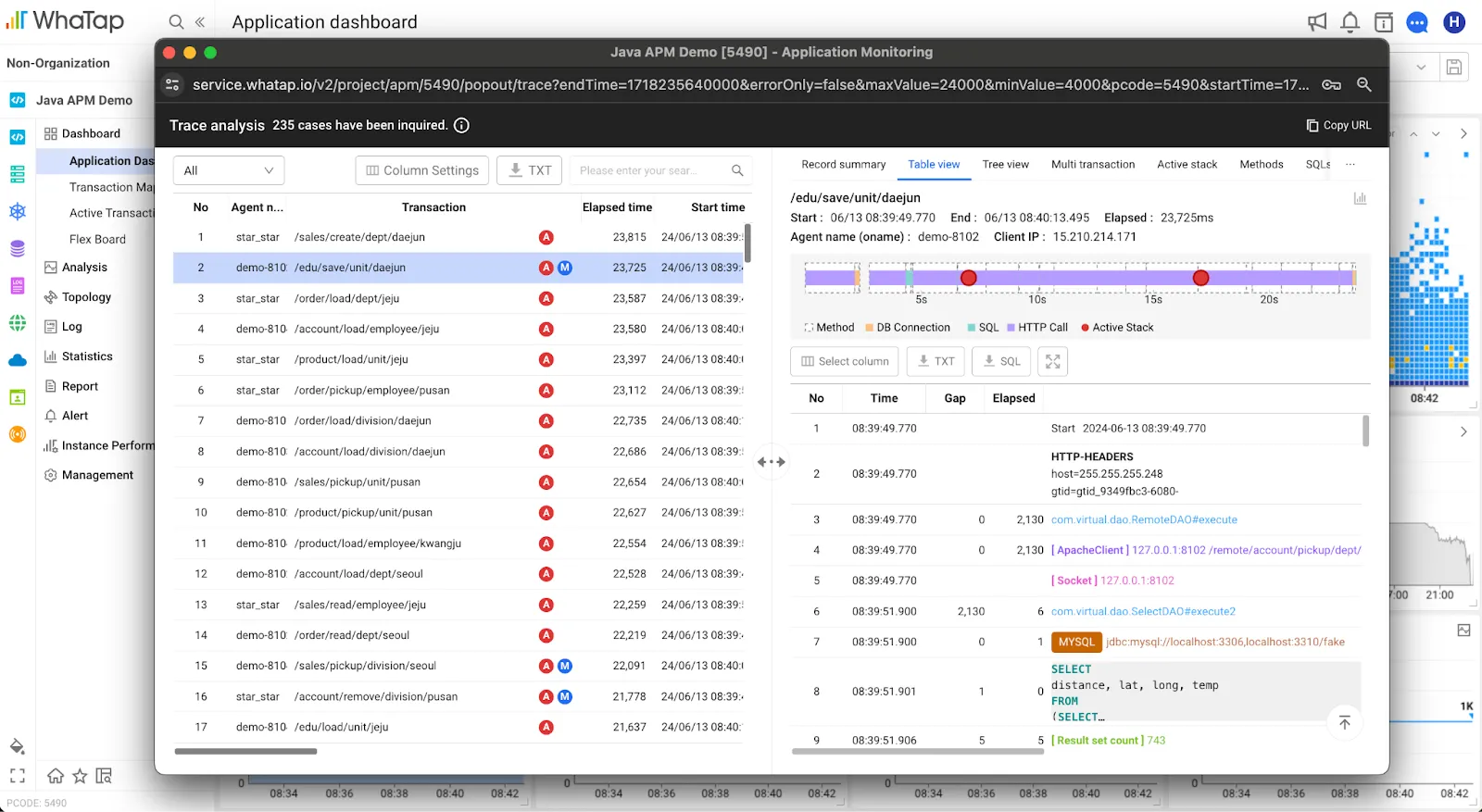
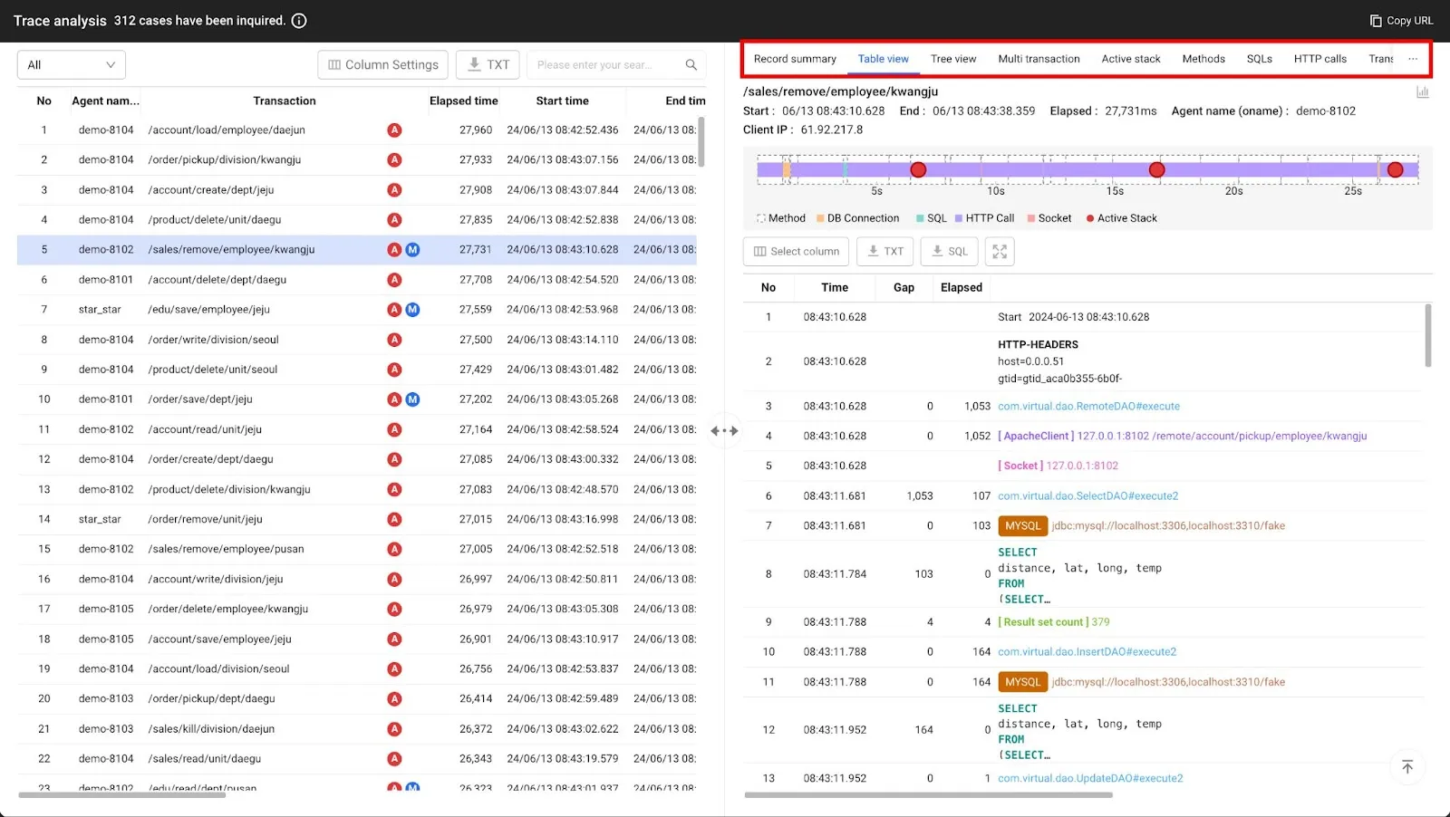
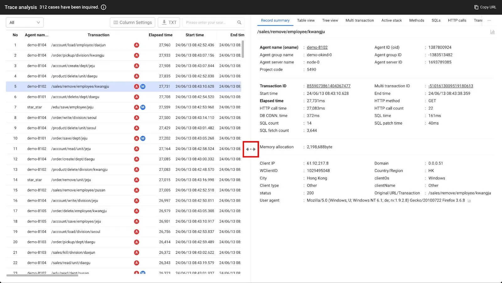
In the previous screen, it was difficult to see more than one transaction trace on one screen even if you moved to a heatmap transaction. In the updated screen, when you drag the heatmap chart, you can see the list of transactions and the stack information under each transaction at once in the trace analysis popup.
By providing this information in a popup, it is easier to compare the data of the sections you want to view on a single screen. In addition, you can now cross-analyze heatmap regions, and you can see stack information immediately when you select a transaction without having to page through. If you want to analyze multiple sections of a transaction, you can now drag transactions to compare and analyze them.
Improved readability for analyzing traces
Previously, the transaction list and transaction stack data were separate, requiring you to open and close modals to analyze more than one transaction in the list. In the updated view, we have integrated them into a transaction analysis popup. The analyze trace popup, which is invoked after dragging the heatmap, is positioned left and right. We designed it to minimize the act of opening and closing the modal by grouping stack information into tabs on the right side immediately after selecting a transaction.
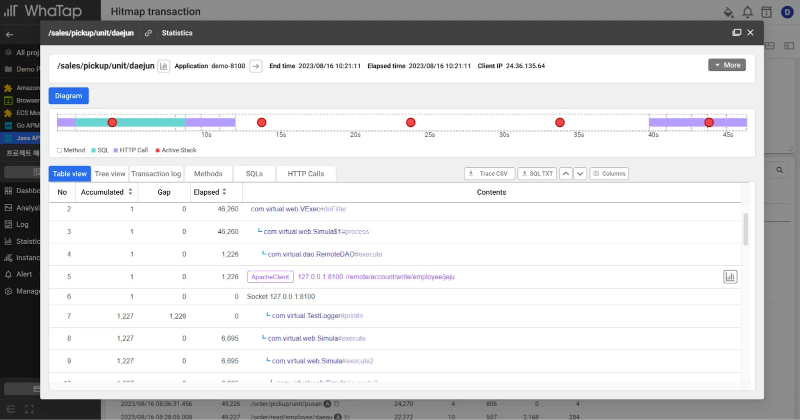
View of the existing transaction table
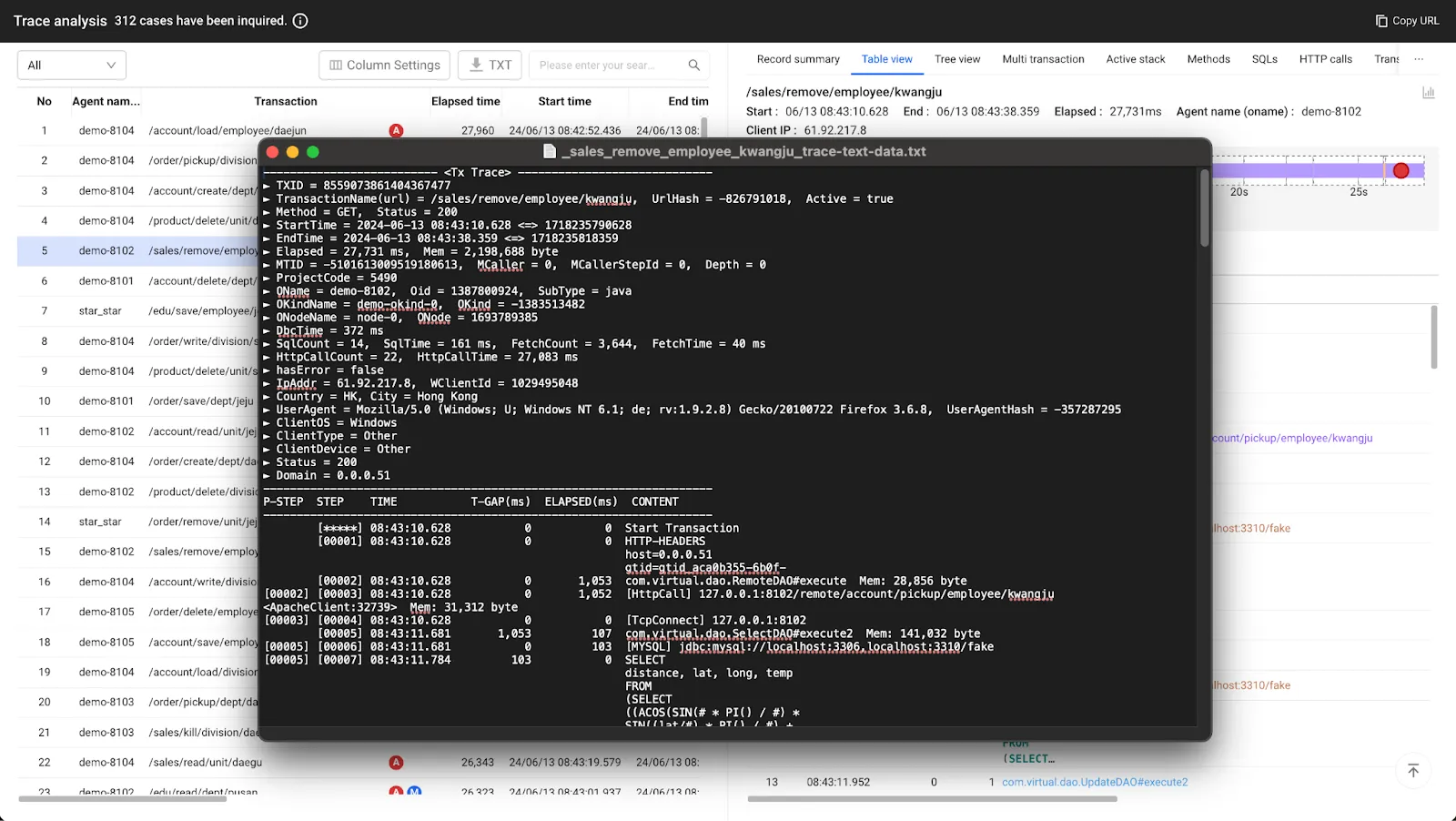
View of the new trace analysis table
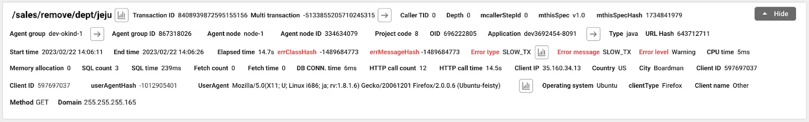
View of the existing records summary
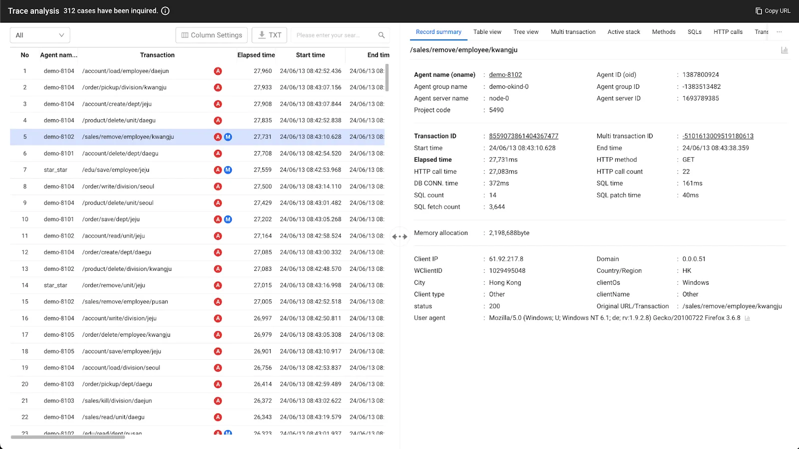
View of the new records summary
If you want to check it from the menu instead of the application dashboard main screen, select [Analytics] → [Heatmap transactions], drag the heatmap, and click the URL you want to analyze in the transaction trace list, and you can compare it through the transaction analysis window.
Path: [Analytics] → [Heatmap Transactions]
We have made the screen width more user adjustable
In the new heatmap trace analysis, you can now see stack information on the fly based on your transaction selection without paging to a split screen to make outlier detection easier. You can also adjust the split screen width via a centralized handler to view the screen at your preferred size.
We have organized transaction list data into a table structure to make it easier to find
The existing transaction list and table view stack information was relatively hard to read when viewing the text (.txt) file. We have improved the way the data is laid out and sorted in a table structure when you download the txt file and SQL file to make it easier to find the data you are looking for.
We will continue to do our best to provide better services and updates to reflect your valuable feedback and data.


